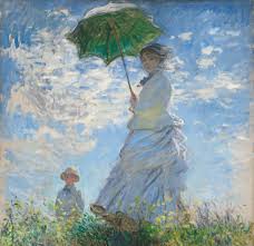
There is perhaps no artistic movement more intrinsically tied to summer than Impressionism. It is a movement defined not by rigid form or historical grandeur, but by light in motion, fleeting beauty, and the quiet luxury of leisure. In a season where days stretch longer and the sun reshapes every…
-
-
There is a particular kind of beauty found along the Mediterranean—one that feels both ancient and effortless. It is not polished in the modern sense, nor is it overly styled. Instead, it is layered by time, shaped by climate, and softened by light. To design a Mediterranean-inspired summer room is…
-
Introduction: The Season of Becoming There is a quiet transformation that arrives each year—soft at first, then undeniable. Spring does not burst onto the scene; it unfolds. Bud by bud, light by light, it reshapes the world. For centuries, artists have tried to capture this fleeting moment of renewal—the tension…
-
February is often reduced to a commercialized version of romance—roses, chocolates, and fleeting sentiment. But historically and aesthetically, February belongs to something deeper. It belongs to Romanticism. Not romance in the superficial sense, but the 19th-century movement that elevated emotion, nature, longing, solitude, imagination, and the sublime. In art, literature,…
-
Traditional design is not merely an aesthetic; it is a philosophy rooted in continuity, craftsmanship, and cultural memory. Among its most evocative expressions is English country style—a look shaped by centuries of landed estates, equestrian life, inherited objects, and a reverence for the patina of time. Few modern designers have…
-
January is the quiet inhale after December’s long exhale. The ornaments are packed away, the lights dimmed, and what remains is the home itself—its bones, its textures, its ability to hold us through the coldest weeks of the year. This is not a month for dramatic reinvention. January interiors are…
-
Every year since 1999, the Pantone Color Institute has selected a color intended to reflect the mood, aspirations, and cultural undercurrents of the year ahead. From bold hues like Viva Magenta to comforting tones like Mocha Mousse, these colors have shaped everything from runway collections to interior design palettes. For 2026, Pantone has made a surprising and…
-
How Designers Use Rust, Ochre, Burgundy & Moss Green — And the Art History Behind Them Every autumn, interior design undergoes a quiet transformation. Soft summer hues give way to richer, moodier tones that echo the changing landscape outside. Rust, ochre, burgundy, and moss green emerge like seasonal old friends,…
-
A Thanksgiving table is more than a place to gather—it is a visual celebration of gratitude, abundance, and connection. A well-designed tablescape has the power to set the emotional tone for the entire holiday, transforming a simple meal into a cherished memory. Whether you prefer the layered richness of classical…
-
There is something undeniably magical about a well-designed reading nook. It is the rare space that belongs entirely to quiet moments. It’s where the world slows, the senses soften, and the imagination opens. Whether carved into the corner of a living room, framed beneath a window, or tucked into an…