
The Golden Ratio, also known as Phi (1.618), is a mathematical concept with a fascinating link to beauty and balance. For centuries, artists, architects, and designers have used it to create visually appealing works. But what exactly is the Golden Ratio, and how can it enhance your designs?
What is the Golden Ratio?
The Golden Ratio is a specific proportion. If you divide a line into two parts, the longer part divided by the smaller part should equal the whole length divided by the longer part. This ratio, roughly 1.618, is found in nature, art, and design.
Why Use the Golden Ratio in Design?
The human eye is naturally drawn to proportions based on the Golden Ratio. It creates harmony and balance, making designs more pleasing and easier to look at. Whether you’re designing websites, logos, or layouts, using the Golden Ratio can elevate your work.

How to Use the Golden Ratio
1. Layout Design: Divide your canvas using the 1.618 proportion. This ensures that no element feels out of place.
2. Typography: Scale your text sizes based on the Golden Ratio for better readability and visual appeal.
3. Logo Design: Many iconic logos, like Apple’s, have been built using the Golden Ratio for their curved lines and balanced shapes.
4. Photography: Use the Golden Ratio to place your focal points where the eye naturally gravitates.

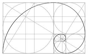
The Golden Rectangle
A simple way to apply the Golden Ratio is through the Golden Rectangle. Divide a rectangle using the ratio, then keep dividing the smaller section. This results in a spiral-like shape, often used in layout design and visual compositions.
Examples in Design
Famous examples include:
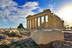
• The Parthenon in Greece, which uses the Golden Ratio for its proportions.
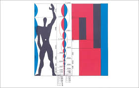
• Le Corbusier’s Modulor system, a tool based on the Golden Ratio used in architecture.
• Modern tech companies like Twitter and Apple incorporate the Golden Ratio in their logos.
Achieving Visual Harmony
By applying the Golden Ratio, your designs can feel more organic and balanced. It ensures that no one part of your composition dominates the others, leading to a natural flow that guides the viewer’s eye effortlessly.
Conclusion
Incorporating the Golden Ratio in design is like unlocking a secret code to beauty. It’s not just about math—it’s about creating balance, harmony, and elegance in every project. Whether you’re new to design or an experienced professional, try experimenting with this timeless principle. It just might take your designs to the next level.
Thanks for reading.
Click to read another article


One comment on “A Pleasure to the Eye: The Golden Ratio in Design”