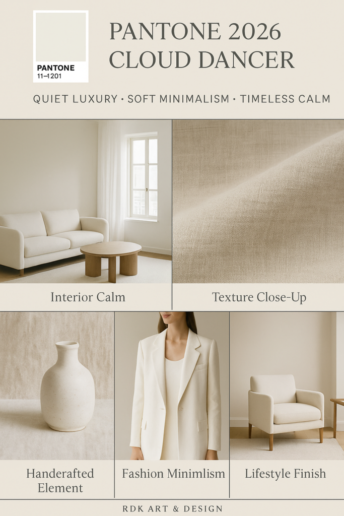
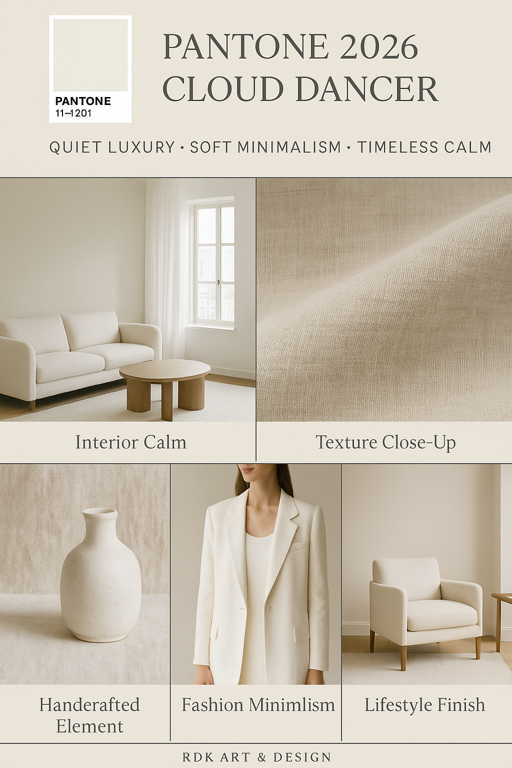
Every year since 1999, the Pantone Color Institute has selected a color intended to reflect the mood, aspirations, and cultural undercurrents of the year ahead. From bold hues like Viva Magenta to comforting tones like Mocha Mousse, these colors have shaped everything from runway collections to interior design palettes. For 2026, Pantone has made a surprising and deeply symbolic choice: Cloud Dancer, a soft, ethereal shade of white.

What Is Cloud Dancer?
Cloud Dancer — officially PANTONE 11-4201 — is described by Pantone as a “lofty white neutral” with an airy quality that acts like a “whisper of calm and peace in a noisy world.” It’s not stark or clinical, but rather a balanced, warm-leaning white that invites simplicity, clarity, and reflection.
In Pantone’s own words, this hue symbolizes a calming influence in a society rediscovering the value of quiet reflection, offering a kind of visual breath amid constant stimulation.
Why White — and Why Now?
On the surface, choosing white may seem anticlimactic compared to the bold shade selections of recent years. But that’s exactly the point. Pantone is leaning into a broader cultural yearning for reset, space, and simplicity.
Here’s what Cloud Dancer represents:
• A fresh start — like a blank canvas ready for creativity and reinvention.
• Calm and mindfulness — a color that encourages serenity in an overstimulated world.
• Versatility and neutrality — pairing effortlessly with vibrant tones or existing interiors and designs.
It’s a color that doesn’t demand attention — it invites it, making space for other design elements to shine while setting a tone of thoughtful calm.
A Polarizing Pick
As with many cultural symbols, Cloud Dancer has inspired a range of reactions:
• Design professionals praise its versatility and cool neutrality that works across fashion, interiors, and product design — from minimalist kitchens to runway looks.
• Critics and color enthusiasts argue whether white can even be a “color of the year,” or whether the choice feels too safe or disengaged from more expressive trends.
• Cultural commentators have pointed out that even a neutral can carry symbolic weight, especially in a global context rich with meaning around white in art, fashion, and society.
Whatever you think about Cloud Dancer, one thing is clear: it’s more than a hue — it’s a conversation starter. Pantone’s selection reflects not just a design forecast, but a cultural moment.
Cloud Dancer in Your Life
Whether you love color or live for minimalism, Cloud Dancer offers plenty of creative possibilities:
• Home spaces: Think textured whites in walls, cabinetry, or soft fabrics — a backdrop that feels both fresh and timeless.
• Fashion: A neutral wardrobe foundation that highlights accessories, silhouette, and movement.
• Everyday objects: From kitchen tools to tech accessories, this hue invites a lighter, airier aesthetic that’s both modern and restorative.
My Final Thoughts
Love it or not, Pantone’s 2026 Color of the Year isn’t just white — it’s a reflection of where we are culturally: seeking clarity, quiet, and a canvas on which to create the next chapter. Whether you embrace Cloud Dancer or challenge its selection, its influence will ripple through design trends in the coming year — perhaps encouraging us all to find beauty in simplicity.
How to Use the Color:
Below are palette ideas and ways to incorporate Cloud Dancer into interiors, fashion, branding, and more.
🌈 1. Palette Pairings: 6 Official Ways to Use Cloud Dancer
Pantone suggests six official palettes built around Cloud Dancer — from soothing to dramatic — showing how different moods emerge when you pair this neutral with other hues:
🌸 Powdered Pastels
Soft, muted pastels like barely-there pinks, gentle lavenders, and pale yellows create a dreamy, understated palette — perfect for bedrooms, nurseries, or soft-focus graphics.
🌫️ Atmospheric Hues
Blues, greens, and misty grays evoke a cloudscape palette that feels fresh and open. Great for bathrooms, offices, or wellness-focused branding.
🛋️ Comfort Zone
Grounded colors like warm tans, muted taupe, or gentle browns give a classic, cozy vibe — ideal for living rooms and lounges.
🌺 Tropic Tonalities
Bright tropical tones (like coral or aquamarine) against Cloud Dancer bring vibrant contrast that still feels light and airy.
🌓 Take a Break
This softer, nuanced palette blends subdued hues with depth and shadow — think gentle grays and subtle muted tones — for a sophisticated minimal look.
✨ Glamour and Gleam
Add metallic accents (gold, bronze, pearl) and polished deep tones to dial up the elegance — perfect for luxe interior details or fashion accents.
Cloud Dancer anchors each of these palettes, letting other colors play the starring role.
🏡 Interior Design Inspiration
Cloud Dancer’s soft white works beautifully as a foundation color, creating calm, bright, and open spaces that feel welcoming:
✨ Walls & Ceilings:
Use Cloud Dancer on walls and ceilings to make small rooms feel larger and lighter. It pairs especially well with warm neutrals like Pumice, Oatmeal, and Bone for a cozy, layered aesthetic.
🛋️ Furniture & Decor:
Neutral upholstery (sofas, armchairs) in Cloud Dancer allows wood tones, greenery, and textured rugs to shine without visual clutter.
🪩 Textures & Accents:
Introduce tactile fabrics — from boucle throws to linen curtains — to give depth and avoid a “sterile” look. Earthy ceramics and natural stone work particularly well.
👗 Fashion & Personal Style
Cloud Dancer transcends seasons and styles in your wardrobe — here’s how designers and stylists are embracing it:
🩶 Monochrome Looks:
Head-to-toe Cloud Dancer ensembles — from tailored coats to oversized knits — create a stunning, minimalist silhouette.
👗 Texture Play:
Use varied fabrics like wool, silk, organza, and knits to make the shade feel rich and tactile rather than flat.
✨ Statement Pairings:
Accent Cloud Dancer with bold jewel tones or metallic accessories to add vibrancy without overwhelming the eye.
🖋️ Branding & Visual Content
In branding or digital design, Cloud Dancer is perfect as a backdrop or neutral foundation:
🎨 Minimalist Aesthetics:
Use it as a base color for websites, social media tiles, or product packaging to evoke calm, clarity, and refined luxury.
🎯 Highlighting Accents:
Let bolder brand colors (blues, reds, greens) pop against Cloud Dancer’s softness. It’s ideal for wellness brands, editorial layouts, and elevated lifestyle visuals.
📊 Clean Presentations:
Because it’s neutral and unobtrusive, Cloud Dancer keeps visual presentations crisp and professional — perfect for pitch decks or portfolios.
🌿 Bonus Palette Ideas You Can Try Now
Here are practical color combos that work beautifully with Cloud Dancer:
🍂 Warm & Cozy
• Cloud Dancer + Oatmeal + Chestnut + Fern
Warm, earthy tones for a grounded, inviting space.
❄️ Cool Minimal
• Cloud Dancer + Charcoal + Navy + Hydro Blue
A crisp, modern aesthetic with subtle contrast.
🌸 Soft & Serene
• Cloud Dancer + Pale Pink + Taupe + Soft Lavender
Ideal for bedrooms or calming brand palettes.


